













💡 How to map incidents without misleading?
Hi all,
I'd like a recommendation on how not to lie with a map. :-) We're mapping various incidents, such as environmental spills or complaints. However, the number of spills or complaints naturally would be higher in areas with more population, more industry, and more transportation corridors. Any suggestions on how to appropriately display spill/complaint locations and frequency on a map, without a deep dive into spatial statistical analysis? Thanks.
I'd like a recommendation on how not to lie with a map. :-) We're mapping various incidents, such as environmental spills or complaints. However, the number of spills or complaints naturally would be higher in areas with more population, more industry, and more transportation corridors. Any suggestions on how to appropriately display spill/complaint locations and frequency on a map, without a deep dive into spatial statistical analysis? Thanks.
If I need to map the complaints then I will map them by complainers’ locations. This is the first step. You may have the issue that populated areas with more complaints. That may not be the case if it is related to some specific environmental concerns. If you think populated area will have more complaints and they are related to population density then you can group them into smaller geographic locations and calculate the rate and use the rate to display. It really depends on what you are try to show and explain.
and what you are trying to convey. Can you provide more context?
--Chris Ryan
Svetlana (Basecamp) wrote:
The issue is about conveying accurate information on a map that helps inform whoever your audience might be, but we lack this information from your message.
I would keep in mind not only the locations (space) but also the time period that you are representing on the map (in fact, you might need more than map if you want to represent the number of spills or complaints per quarter, per year, etc.)
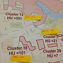
As was pointed out by others, you may want to aggregate your point counts to geographic units given your socio-political context (e.g., cities, census designated places, health districts, etc) and calculate rates to the underlying population within such geographic units.
Thanks, and good luck.
Ricardo Contreras
I just got your second message through Base Camp.
From your example below, it sounds as if your study would benefit from adding a city-specific weight that mirrors the ‘intensity’ of industrial activity or industrial output in each city. Controlling by industrial output would be a good way to show production output (that’s the ‘intensity’ factor I am thinking of). I can think of the Industrial Production Index (IPI), which is an economic indicator published by the Federal Reserve Board of the United States. It measures the real production output of manufacturing, mining, and utilities. You have the number of spill incidents by city. You would need to weigh the number of spills against the city-specific IPI and represent the resulting ranking of each city on your map. Just a thought.
Thanks,
Ricardo Contreras